Gamma Correction, Cadavers, and Monitors
Original Post: 14 May 2013
Posted Here: 1 December 2017
With Michael 4 or Virginia 4 Caucasian add-ons for Poser Pro 2012, I found that the skin textures have a pale blue-green Diffuse color to accompany the texture maps. This blue-green color is noticeable in the Preview and becomes especially obvious after a render--the skin has little, if any, pink tone and looks (on my system) what I call "cadaverous." Changing the Diffuse color of all the skin textures to White in Materials allows the Caucasian skin to look a bit more natural, although a bit lighter than what is seen in the Preview. One way to correct for this was to use a Diffuse color such as RGB = 226:208:249 instead of White.
Even when using this correction, I saw in renders of head shots that a sort of "fog" seemed to cover the image: this not only made the skin textures lighter than in the Preview but the eyebrows were also lighter and the eyes lost their sparkle. If I rendered using the "Area Render" function to do just a box around the eyes and eyebrows, I could watch the fog move in.
I tried all sorts of changes in Poser's Materials Room. I even fiddled around a bit in the Advanced tab. Nothing helped. So I checked the Render Settings. Not much there looked helpful. (Which meant that I wouldn't have to mess around very long.) One setting is "Gamma Correction." I had no idea what that was for, but it's something that can be set for individual textures as well as for the entire render.
I first heard of "gamma" when I used Photoshop, but couldn't see what it was for. I checked the Poser Reference Manual's index and found a reference to using Gamma Correction. Unfortunately, it didn't tell what Gamma Correction was for. Perhaps some other part of the Manual did, but I couldn't find it. (Should I say, "Surprise, Surprise!"?)
Wikipedia's Gamma Correction page didn't help me. Another Internet page (which is no longer available) seemed to saying that Gamma Correction had something to do with helping to maintain details in the highlights and shadows (I thought that was what contrast was all about.)
I experimented: I turned Gamma Correction off. When I rendered, I found that my images looked much better--even the cadaverous ones. Contrast was greatly enhanced, perhaps too much in some cases. So I turned Gamma Correction back on, but changed the value from the default of 2.2 to 1.0. I really couldn't see much difference between Gamma Correction = 1.0 and Gamma Correction Off. Renders with Gamma Correction = 1.5 were better than those at 2.2, but the fog was still creeping in.
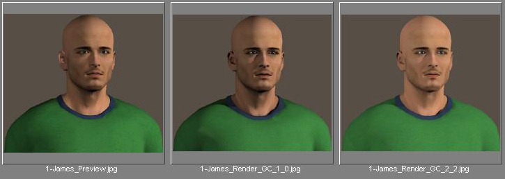
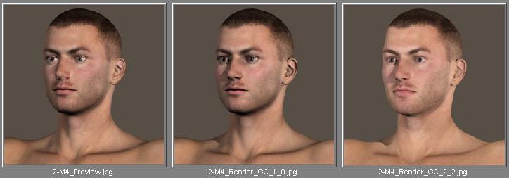
Below are some screen captures of Previews and of Renders at Gamma Corrections of 1.0 and 2.2:
The first series is Poser Pro 2012's James character:
The second series is DAZ 3D's Michael 4:
The third series is DAZ 3D's (cadaverous) Beck:
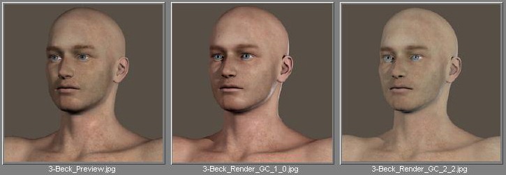
Neither James nor Michael have the blue-green Diffuse color. You may not be able to see the difference in the eyes here between Gamma Corrections of 1.0 and 2.2, but they are much better at 1.0 with all characters--on my system.
I've mentioned images viewed "on my system" a couple of times here. This is because I contacted DAZ 3D's Tech Support to ask about the reason for the blue-green Diffuse color. I was asked to send the Tech Support guy a sample render. So I sent him Beck and Michael. He replied that he'd tried my cadaverous Beck on three different monitors and got three different results. On one, Beck looked cadaverous, on a second he looked fine, and on the third he looked too "warm." In fact, when viewed on the CRT monitor for my rarely-used tower computer, Beck's gray background was brown and Beck himself looked about right.
The Tech's conclusion was that different monitors can give surprisingly different results and that the creator of the models with the blue-green Diffuse color had probably adjusted the skin tones to look good on his/her monitor. That leaves us with the question of why, for instance, Beck's creator adjusted the skin tones with the Diffuse color instead of doing it directly on the texture map? How did he get the texture map "right" for my computer before correcting it for his? Perhaps the map was created on a computer with a different monitor and then the final product was readied on the one needing the correction.
I would be interesting in learning what the above images look like on your monitor(s).
I'd like to leave you with a warning: Don't be surprised if someone else's graphics don't look right on your monitor and if yours don't look right on theirs.
Keep reading/keep writing - Jack